TLDR: Yes.
So, as a front-end developer, I sometimes have to ask myself: “Wow, this is a really cool new technology. Can I use this in my workflow in a production website at work, or does it sound better in theory than in practice?” I find myself always evaluating new CSS specifications to see if it will make my designs better and make my code more succinct and easier to manage.
Flexbox is great for responsive design
Flexbox is not a new feature… BUT, with the influx of new mobile devices in recent years, and their need for flexible, responsive layouts and patterns, it’s something you should definitely consider rolling into your next project, if you haven’t already. Don’t worry, though — you can use it side-by-side with whatever grid framework you use. I’m still using a modified version of Skeleton Grid which I’ve added some SASS variables and mixins to. If you really wanna get crazy, try using Flexbox with vh or vw units instead of pixels or percentages.
But what about desktop browser compatibility?
Don’t worry, I got you, fam. Check out the compatibility chart over at CanIUse.com. At the time of this writing, the current browser offerings all support Flexbox, with IE 11 being the only stalwart lagging behind with “partial support.” This can be overcome if you take into account the known bugs and work with them.
So Internet “Exploder” is still a pain in the ass, though, right?
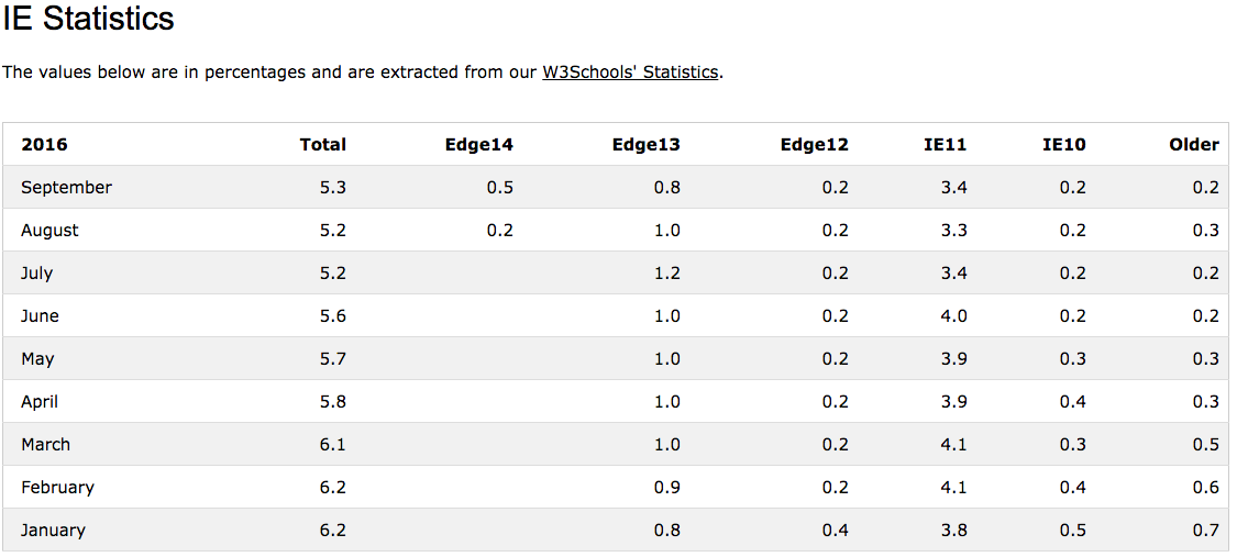
Yes, but their market share is so small, I wouldn’t sweat it. Just look at the latest IE usage stats over at W3C. At the time of this writing, IE10 and older only represent 0.4% of ALL BROWSERS currently in use (see figure 1.1) . But, before you use Flexbox in your next project, you should also consider if your client’s user demographic skews higher in IE10 by reviewing analytics, if possible.

figure 1.1
Ok. So there’s wide support, but how do I start using it?
Instead of trying to recreate Flexbox demos that already exist, you should definitely read “A Complete Guide to Flexbox” by acclaimed CSS guru, Chris Coyier AND “A Visual Guide to CSS3 Flexbox Properties” published by Dimitar Stojanov. Both articles have great explanations and depictions of the Flexbox rules in use. I often refer back to these articles when I’m trying to integrate Flexbox into my layouts… since it’s still a bit fresh to me as well.
Check out this live demo.
This is how I’ve been using it in my work
One of the main programming mantras you’ll hear from time to time is “Don’t Repeat Yourself,” also known as DRY. In the spirit of code brevity, I’ve integrated Flexbox into my work by adopting this great SASS mixin library which takes all the headache of having to account for all of the browser prefixes. Don’t know what SASS is? You might want to read my last article.
The following mixin allows me to call all five Flexbox definitions with one single line:
@mixin flexbox {
	display: -webkit-box;
	display: -webkit-flex;
	display: -moz-flex;
	display: -ms-flexbox;
	display: flex;
}
.element {
	@include flexbox;
}
Easy, peasy.
Consider all the Flexbox rules, and that’s a lot of saved time. I don’t think browser prefixing will be an issue for long, as it seems that all the major browsers have started to embrace the syntax. But this mixin library should fill the gap, in the meantime. Here’s more information on all the different browser prefixes.
So, I’ve discussed at length why it’s great, and how to integrate it into your workflow… but you’re probably wondering “How are you actually using it in your designs?” Okay… so I’ve got Flexbox in action over at this recently-launched client website for Next Door Milwaukee.
In this project, the Art Director’s designs required tightly packed grids without column gutters, and overlay text that would need to be vertically-centered (see figure 1.2). Vertical-centering has been a difficult to achieve since the web development community at large stopped using tables for page layout. We’re able to easily achieve these results by using “align-items: center;” Flexbox rule.

figure 1.2
By employing Flexbox, I was easily able to normalize the heights of grid items, despite the content within, without having to set explicit heights, making for a more uniform look, but also letting the boxes grow and shrink, as needed — which is great for building responsive websites. Below is an example, taken directly from the Next Door Milwaukee website:
The HTML:
<section id="section-1" class="dualCTAbox flexcontent row">
	<div class="ctaBox" style="background-image:url('image_1.jpg');">
		<a href="#">
			<div class="icon"><img src="icon1-108x72.svg" width="52" height="35" alt="Section Title 1"></div>
			<h5>Section Title 1</h5>
			<p>Tation aliquip vulputate ex sit facilisis accumsan te eu nonummy feugait autem.</p>
			<div class="btnWrapper"><span class="button button-primary">Learn More</span></div>
		</a>
	</div>
	<div class="ctaBox" style="background-image:url('image_2.jpg');">
		<a href="#">
			<div class="icon"><img src="icon2-108x72.svg" width="52" height="35" alt="Section Title 2"></div>
			<h5>Section Title 2</h5>
			<p>Tation aliquip vulputate ex sit facilisis accumsan te eu nonummy feugait autem.</p>
			<div class="btnWrapper"><span class="button button-primary">Learn More</span></div>
		</a>
	</div>
</section>
The SASS (using nested CSS):
.dualCTAbox {
	@include flexbox;
	@include align-items(stretch);
	@include align-content(stretch);
	@include flex-wrap(wrap);
	.ctaBox {
		text-align:center;
		@include align-self(stretch);
		@include flexbox;
		a {
			@include flexbox;
			@include align-items(center);
			@include justify-content(center);
			@include flex-wrap(wrap);
			@include align-content(center);
			div,
			h5,
			p {
				width: 100%;
				margin-bottom: .8em;
				line-height: 1.2em;
			}
			h5 {
				margin-bottom: 0;
				line-height: 1.2em;
			}
			width: calc(100% - 40px);
			padding: 20px;
			min-height: 240px;
		}
		.button{
			margin-bottom: 0;
		}
	}
}
Now, if one were to throw CSS Media Queries into the mix, you can get really nutty and update element widths based on the viewport width. You can even change the order an element appears within the browser. This is especially important on mobile devices when you really need to be empathetic to the user and re-sorting the navigation, sidebar, or “Call to Action” items to achieve the best possible experience on smaller screens.
If you haven’t jumped in yet, come on in, the water’s fine. It’s practically 2017, let’s keep pushing things forward.


